
Creating a nursery converts a simple space into your baby’s first haven.
Paint color selection becomes an intimate expedition where practicality meets emotion.
Soft pastels, such as sage green, create calming atmospheres.
Bolder choices like dusty rose add personality without overwhelming tiny senses.
Consider natural light, room size, and your family’s style.
The perfect shade should feel nurturing to you, since you’ll spend countless hours here, too.
Whether choosing gender-neutral earth tones or vibrant accent walls, let the color reflect the joy and dreams you hold for your little one’s future.
Let’s Paint the Town: Fun Nursery Color Ideas
Alter your nursery into a vibrant, cozy haven with these delightful paint color ideas!
If you’re aiming for soothing pastels or lively hues, each shade will set the perfect tone for your little one’s dream space.
Let the colors inspire joy and comfort!
1. Baby Blue
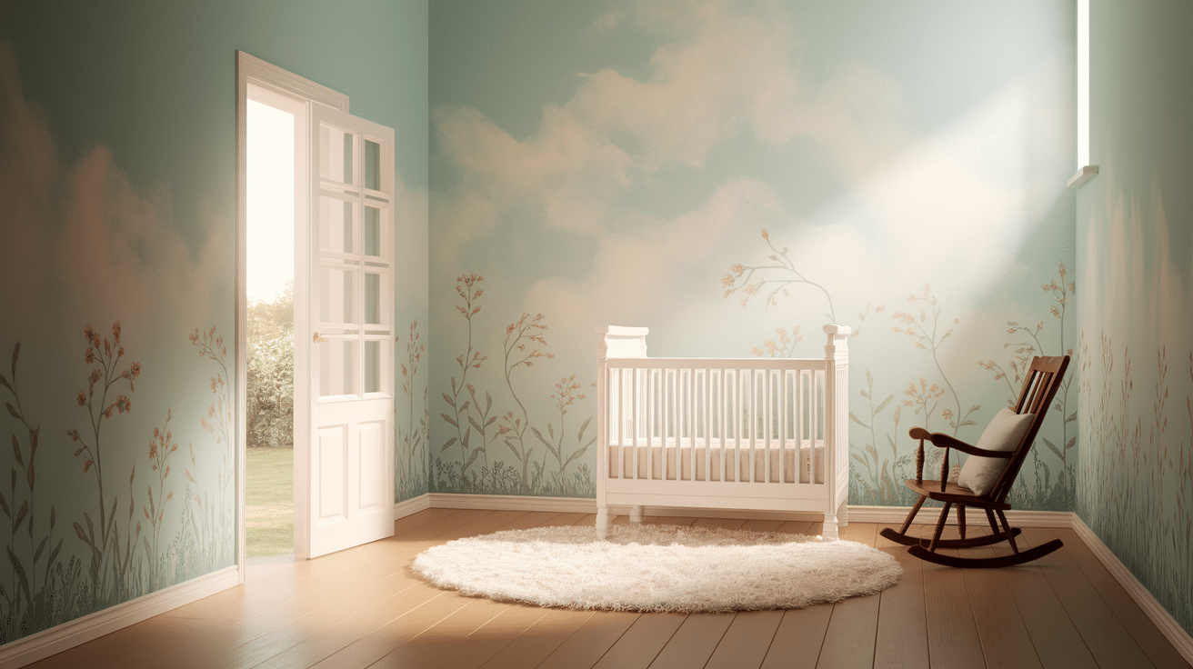
Baby Blue is a classic nursery color, offering a soft, calming atmosphere that is perfect for both boys and girls.
It brings a sense of serenity and peace to the room, making it an ideal choice for a baby’s first space.
Baby Blue pairs well with whites and pastel accents, creating a tranquil, welcoming environment.
2. Blush Pink
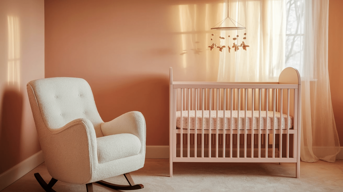
Blush Pink is a gentle, warm hue that evokes feelings of softness and comfort.
Its subtle pink tones are ideal for creating a soothing environment in the nursery.
Perfect for a modern yet feminine touch, Blush Pink works well with neutral colors and can be paired with a variety of fun accent shades.
3. Buttercup Yellow

Buttercup Yellow is a cheerful and sunny shade that brings warmth and brightness to a nursery.
It radiates positivity, creating a joyful and lively atmosphere.
This color can be paired with soft neutrals or accents of pastel tones to balance its vibrant energy, making it a great choice for any nursery.
4. Celestial Blue
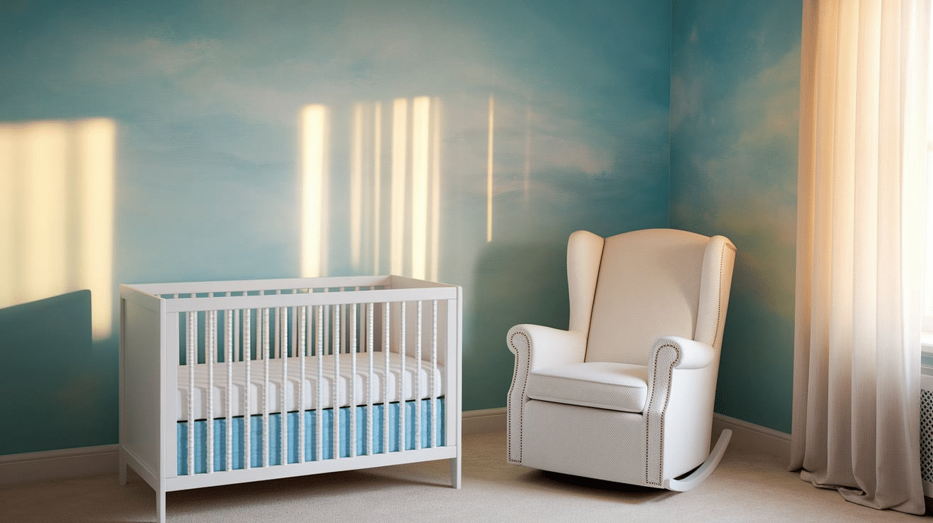
Celestial Blue is a dreamy, soft blue that mimics the clear sky.
Its calming qualities are perfect for a nursery, providing a peaceful and relaxing space for rest.
It blends well with other pastel tones or white, creating a serene environment that is ideal for both sleep and play.
5. Coral Reef
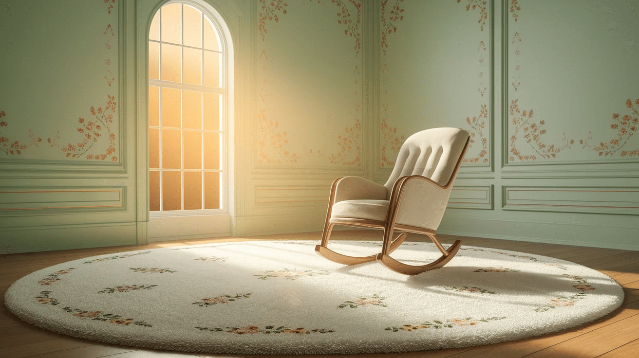
Coral Reef combines soft orange and pink tones, offering a vibrant yet gentle touch to any nursery.
This lively color adds warmth and energy while maintaining a calming effect.
It pairs well with neutral accents or other pastel shades to create a balanced, inviting room.
6. Cotton Cloud White
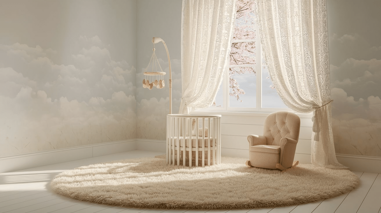
Cotton Cloud White offers a clean and crisp backdrop for a nursery, enhancing the room’s brightness.
It reflects light, making smaller spaces feel larger and more open.
This neutral hue complements virtually every other color, allowing for flexible design options and vibrant accent colors.
7. Creamy Beige
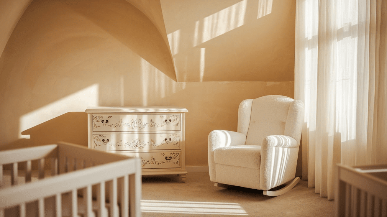
Creamy Beige is a warm, neutral shade that evokes a sense of comfort and simplicity.
It creates a cozy atmosphere, perfect for a restful nursery.
This color pairs well with other soft pastels or bright accents, creating a gentle contrast that remains timeless and classic.
8. Dusty Rose
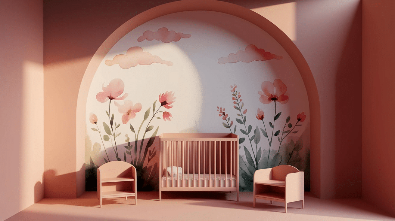
Dusty Rose is a refined, muted pink that offers a calming and cozy feel.
Its subtle pink hues are less intense than traditional pink, providing a more mature yet soft atmosphere.
It pairs beautifully with whites, creams, or even darker tones for a balanced and inviting space.
9. Icy Mint

Icy Mint brings a refreshing, cool vibe to a nursery.
The pale green tones create a calming, refreshing atmosphere that helps promote relaxation and rest.
This pastel shade pairs beautifully with soft whites, subtle pinks, and blues, creating a refreshing and peaceful space for babies.
10. Lavender Fog
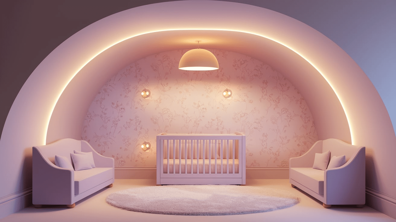
Lavender Fog is a soft, muted purple with gray undertones.
Its calm and gentle hue creates a soothing ambiance in a nursery, making it a great choice for a sleep-friendly environment.
It works beautifully with soft neutrals and other pastel colors, offering a refined and peaceful atmosphere.
11. Lilac Breeze
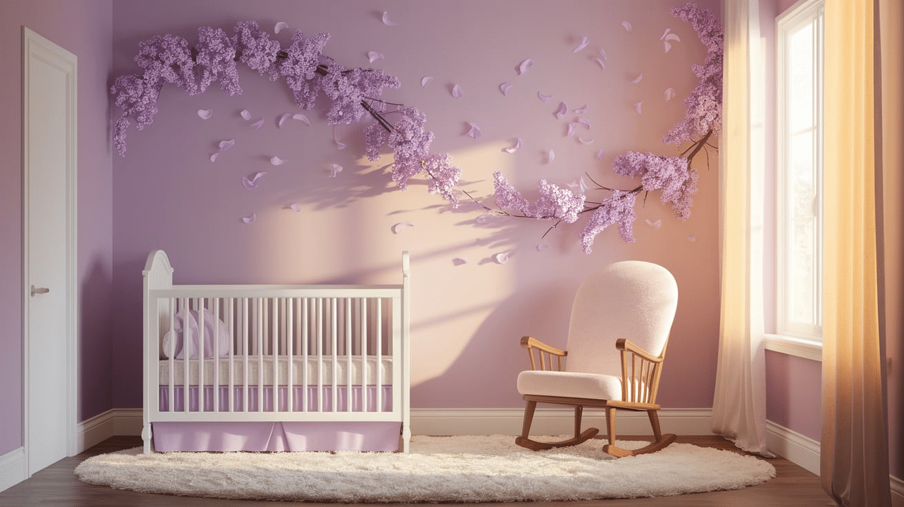
Lilac Breeze combines light purple and pink hues, offering a fresh and airy feel.
This color is perfect for creating a playful yet tranquil nursery environment.
Lilac Breeze pairs well with whites, creams, and soft greens, adding a whimsical touch to the space while maintaining a relaxing ambiance.
12. Lilac Mist
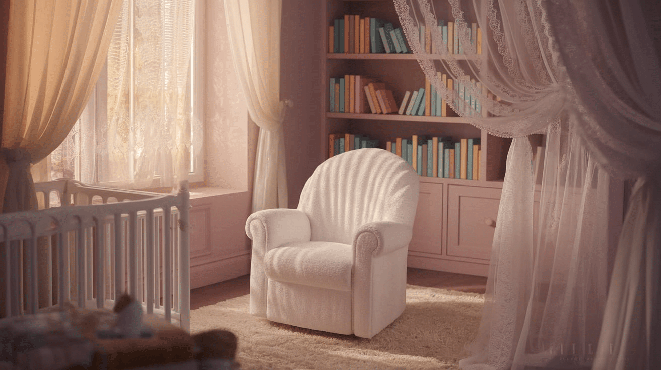
Lilac Mist is a pale lavender color with a delicate touch of gray.
This soft, ethereal shade is perfect for a nursery where a calming and serene atmosphere is desired.
Lilac Mist pairs effortlessly with light neutrals and pastel tones, creating a space that feels light and peaceful.
13. Mint Green
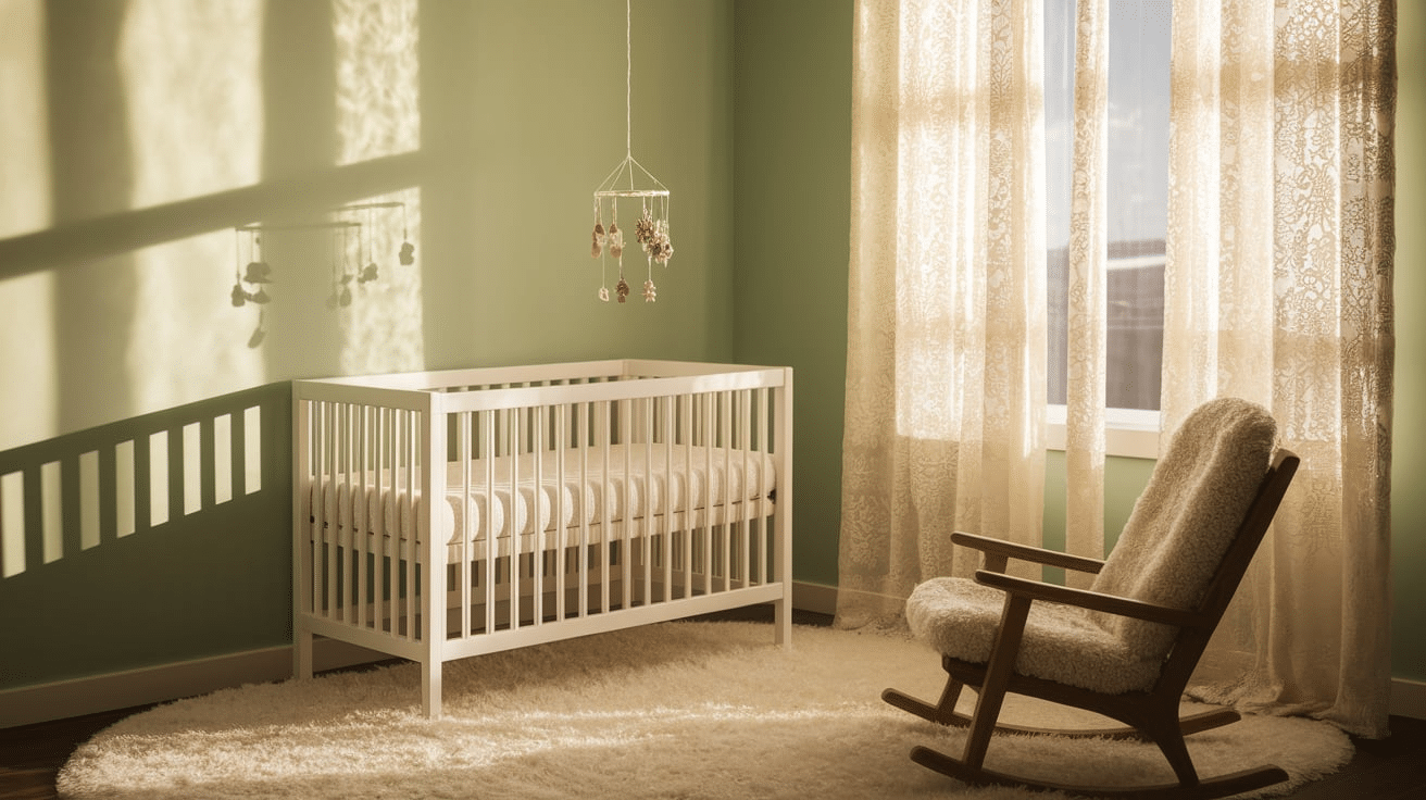
Mint Green is a refreshing, cool color that brings a peaceful and relaxed vibe to any nursery.
Its soft, pastel tones help create a calm and soothing environment ideal for rest.
Mint Green pairs beautifully with soft neutrals, pinks, or yellows, offering a versatile choice for a nursery palette.
14. Pale Peach

Pale Peach offers a subtle yet warm color that feels fresh and inviting.
This gentle shade creates a cozy atmosphere in the nursery and works well with light accent colors.
Pale Peach can be combined with whites or creams to brighten the space, creating a welcoming and peaceful environment.
15. Pale Yellow
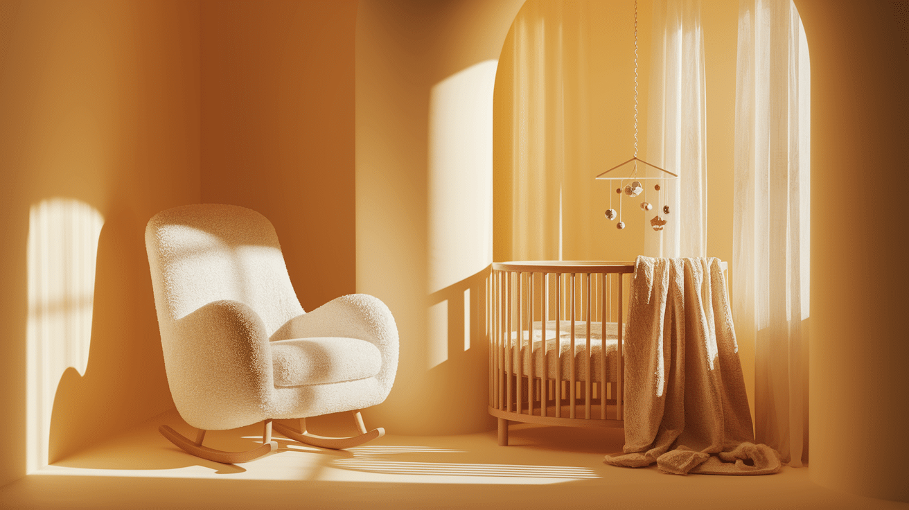
Pale Yellow is a soft, sunny hue that infuses the nursery with warmth and cheerfulness.
Its light tone provides a calm and inviting atmosphere, perfect for both daytime and nighttime.
Pale Yellow pairs well with soft greens, blues, or even grays, offering a versatile color choice for a nursery.
16. Peachy Coral
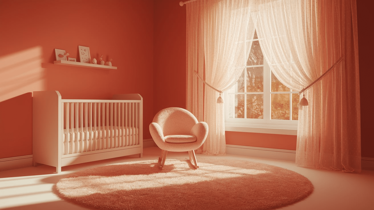
Peachy Coral blends soft peach and coral tones, creating a lively yet soothing environment.
This vibrant color brings energy and warmth to the nursery while maintaining a calm and comforting feel.
Peachy Coral pairs well with whites, creams, and other pastels, offering a gentle, welcoming touch.
17. Peony Pink
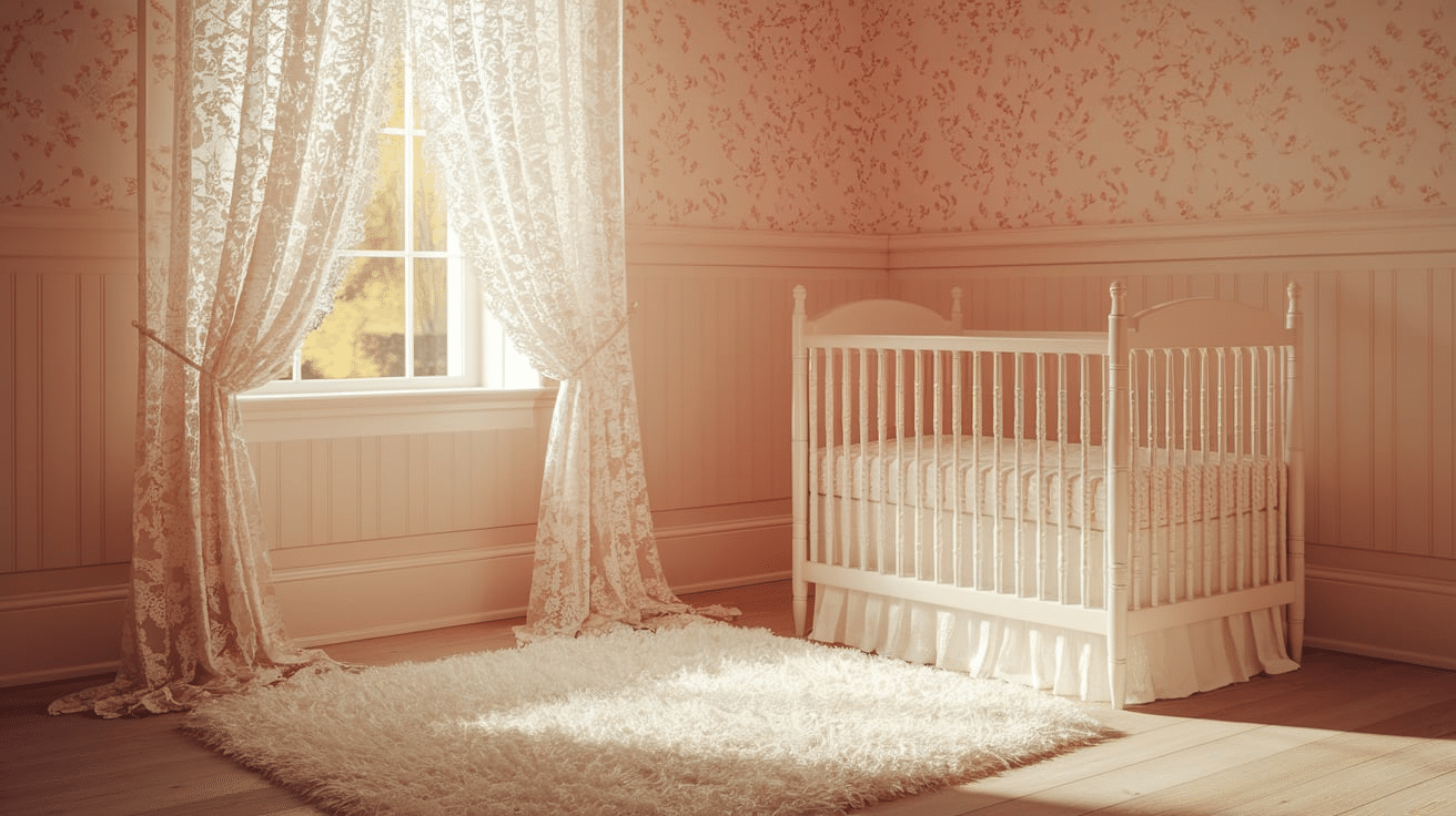
Peony Pink is a vibrant yet soft pink that brings a pop of color without being overpowering.
This lively color offers a playful, joyful vibe, making it perfect for a nursery filled with energy and fun.
Peony Pink pairs beautifully with lighter shades and can be used as an accent or main color.
18. Periwinkle Purple
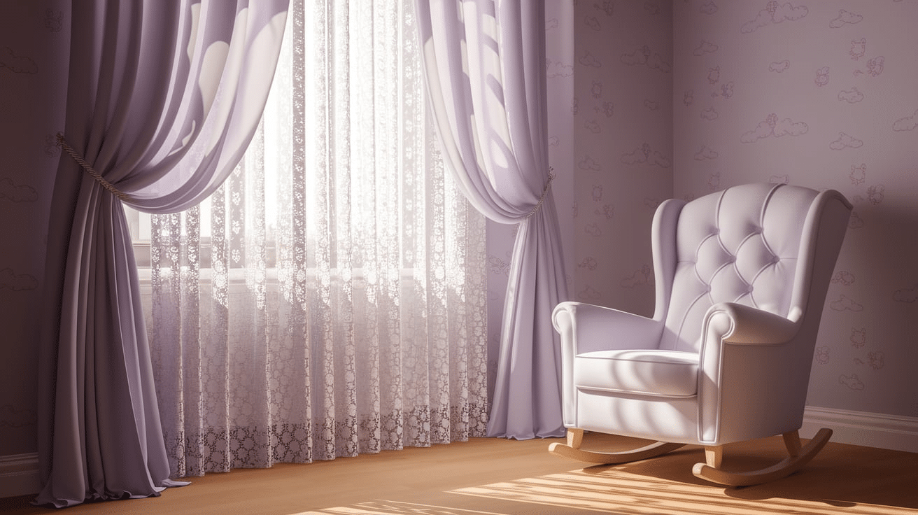
Periwinkle Purple offers a beautiful blend of blue and purple tones, creating a soft yet bold effect in a nursery.
This color brings a sense of creativity and calmness, making it ideal for a space where relaxation and playfulness coexist.
Periwinkle pairs well with whites, yellows, and greens.
19. Powder Blue
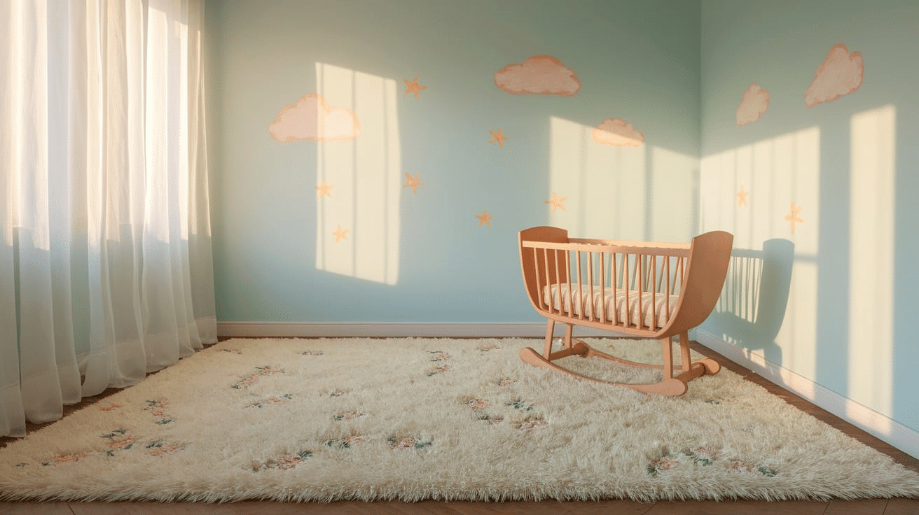
Powder Blue is a soft and gentle shade of blue that promotes a calm and peaceful environment.
This color is perfect for nurseries where rest and relaxation are a priority.
Powder Blue can be paired with whites or soft greens to create a serene, quiet space, and it complements both boy and girl nursery themes.
20. Robin’s Egg Blue
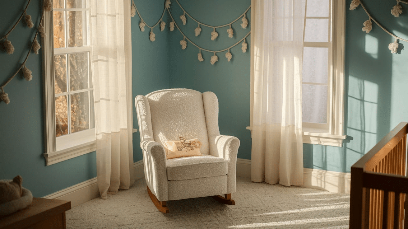
Robin’s Egg Blue is a soft, pastel blue with a slight green undertone, offering a fresh, airy feel to a nursery.
This soothing color creates a tranquil environment, ideal for sleep and relaxation.
Robin’s Egg Blue pairs beautifully with whites and soft yellows, adding a gentle, peaceful touch.
21. Sky Gray

Sky Gray is a muted, neutral gray with cool undertones.
This versatile color provides a calm, serene atmosphere, making it perfect for a restful nursery.
Sky Gray pairs well with other pastels and brighter colors, providing a balanced backdrop for playful accents and soft furnishings.
22. Soft Aqua
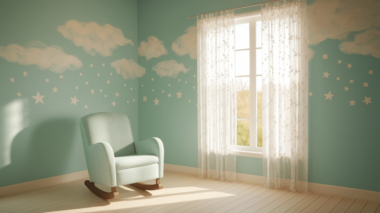
Soft Aqua brings a cool, refreshing touch to any nursery.
This light, pastel blue-green shade creates a peaceful, relaxed environment.
Soft Aqua pairs beautifully with soft grays, whites, and light pinks, creating a calm, nurturing space perfect for sleep and play.
23. Soft Lavender

Soft Lavender is a soft and serene purple tone that evokes calmness and peace.
This gentle color creates a restful atmosphere in the nursery and pairs beautifully with whites, grays, or other pastel shades.
Soft Lavender is perfect for creating a soothing environment for your little one.
24. Soft Olive Green
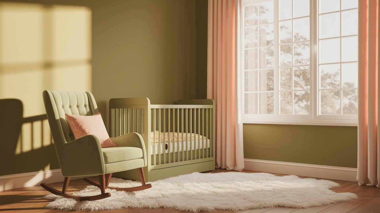
Soft Olive Green brings a gentle, earthy tone to a nursery, offering a grounded and peaceful environment.
This muted green color pairs well with warm neutrals, creams, and other pastel hues, creating a calming atmosphere that feels cozy and welcoming.
25. Sunny Lemon
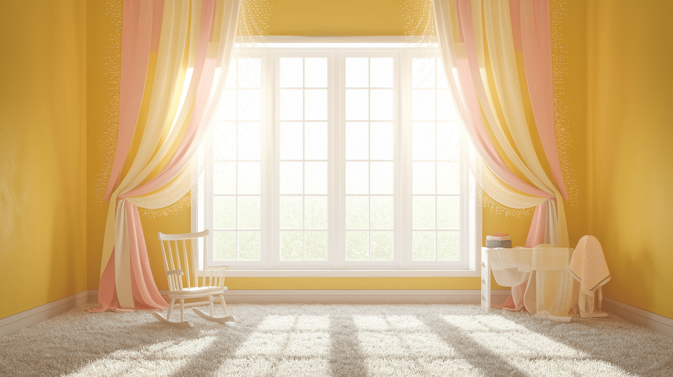
Sunny Lemon is a bright and cheerful yellow that injects warmth and happiness into the nursery.
This vibrant color is perfect for creating a positive and uplifting space.
Sunny Lemon pairs well with whites, soft blues, or greens, creating a fresh and vibrant atmosphere that encourages play and joy.
26. Vanilla Cream
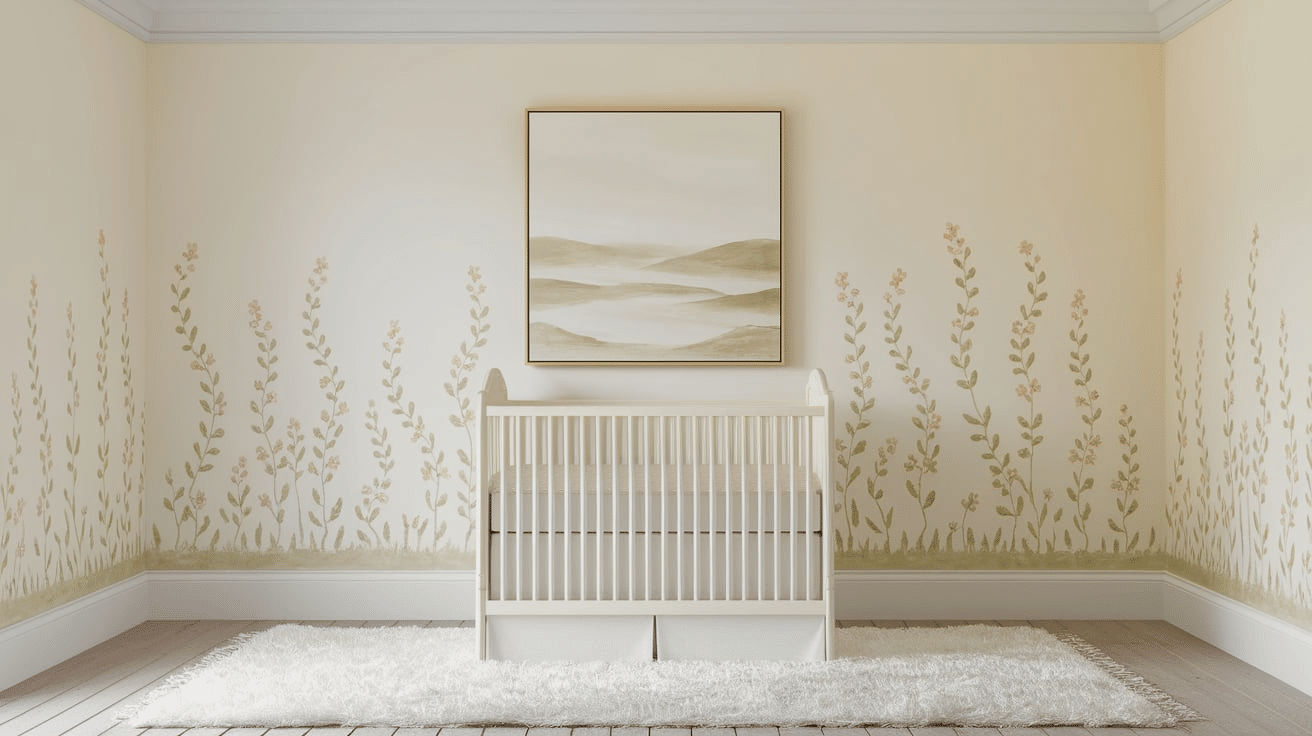
Vanilla Cream is a warm, soft off-white with a touch of yellow.
This cozy, inviting color brings warmth to a nursery while maintaining a light, airy feel.
Vanilla Cream works well as a base color, allowing for easy pairing with other vibrant hues or soft pastels for a welcoming space.
27. Warm Taupe

Warm Taupe is a neutral, earthy brown that adds depth and sophistication to a nursery.
This color creates a cozy, calm environment perfect for rest.
Warm Taupe pairs well with soft pastel tones or vibrant accent colors, offering a versatile option for a nursery space that feels grounded and serene.
Final Thoughts
Selecting the ideal nursery paint color is a deeply personal and transformative process that reflects parental love and creative vision.
Each carefully chosen shade tells a unique story of comfort, joy, and the anticipation of new life’s precious beginnings.
The perfect color can create a nurturing environment that supports a baby’s emotional and developmental trip.
From soothing pastels to vibrant hues, every paint choice becomes a canvas of possibility and potential.
Parents invest tremendous thought and emotion into creating a space that feels safe, inspiring, and filled with wonder.
The right color converts a simple room into a magical world of comfort and endless imagination.

