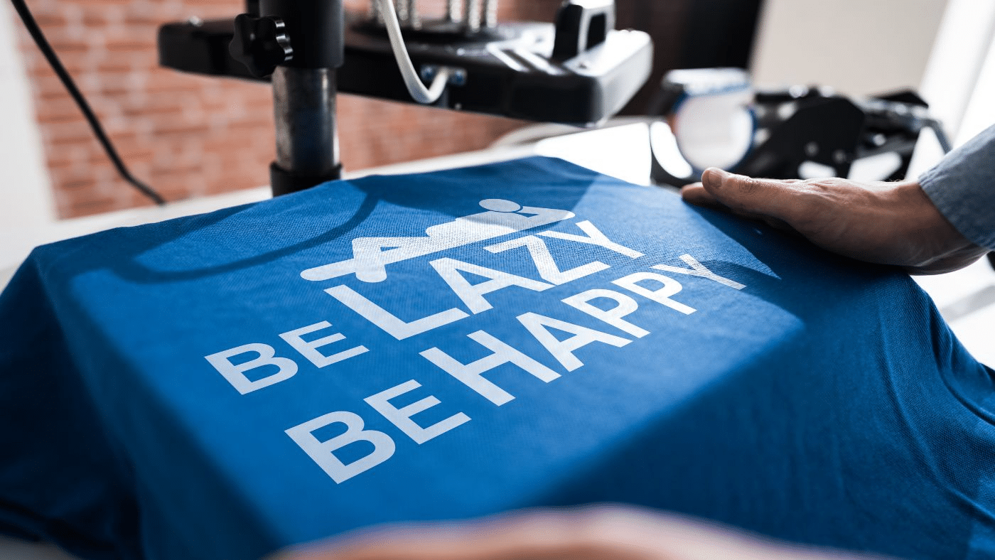
Throwing a logo on a hoodie or cap sounds easy. But when it comes out printed, you’ll realize the pain if it shows that it didn’t land. Maybe the colors clash, or the garment just doesn’t vibe with what the brand stands for. That moment of regret is avoidable, but only with the right prep.
Logos aren’t magic wands. They need the right setup to work. Before heat presses fire up or embroidery machines start stitching, a few steps can help make sure that gear hits right, not just looks branded.
Think Beyond the Logo File
The first step has less to do with the logo and more to do with the bigger picture. What’s the mood? Who’s wearing this? What’s the reaction when someone sees it from across the street?
A lot of gear gets printed just to have something. But the brands that build followings think through the purpose of every wearable. Is this for giveaways or everyday wear? Will it be used in photoshoots or handed out at events? Each scenario calls for a different kind of design energy.
Choosing colors, cuts, and garment types without knowing the context usually leads to regret—or worse, leftovers that sit in storage.
Pick the Right Base First
Before any design moves happen, the blank has to match the brand. A heavyweight crewneck doesn’t serve the same function as a lightweight zip-up. Just like a structured snapback doesn’t hit the same way as a dad cap.
Think of the fabric as your foundation. Once it feels right, the design elements can be layered on. Skipping this part leads to weird outcomes—like putting sleek, modern branding on a baggy tee that reads more retro than refined.
That includes sizing. If you’re only ordering standard unisex cuts, half your audience might not wear them. That matters.
Design with Real-Life Wear in Mind
Logos don’t live in Photoshop. They live on shoulders, chests, backs, and brims. That shift from screen to skin changes how things look. What reads clean and minimal on a digital mockup can look awkward when stitched too high or printed too small.
Print size should fit the garment’s vibe. A massive logo across the back of a sleek cropped tee won’t feel as balanced as it might on an oversized hoodie. Likewise, tiny embroidery might disappear on a busy patterned fabric.
Custom hats are a prime example. The logo size, thread weight, and placement make or break the final product. Too wide, and it warps. Too detailed, and it gets lost.
Test Before You Commit
Don’t rush to print hundreds without trying a sample first. See the real thing in real lighting. See it on a real body if possible.
Here’s what a solid pre-launch step might include:
- Order blank samples in different sizes
- Print a few logo variations for comparison
- Try designs on different colorways. This helps spot contrast issues.
- Photograph mockups of people, not mannequins
- Wash-test everything before making bulk decisions
This small delay upfront can save weeks of reprints and reorder headaches later.
Make It Feel Intentional
Once the logo and garment are paired, there’s still room to push the experience further. It’s not always about going louder or adding more. Sometimes the best move is restraint with a few personal touches that show thought.
Hangtags with handwritten notes or short brand stories go a long way. So do interior neck prints with unique details, like a launch date or a quote that ties back to the collection. Even just picking a thread color that matches a brand accent can pull the whole piece together.
When wearables feel curated instead of slapped together, people notice. That difference shows up in how often they wear it, talk about it, and tag you online.
Don’t Let the Trend Lead the Brand
Trends will tempt. Oversized logos, puff print, tonal-on-tonal embroidery—each one will have a moment. But when the branding gets shaped by trends more than intention, it loses its staying power.
The best wearable branding doesn’t scream for attention. It earns loyalty through consistency, comfort, and a clear voice. Trends can be tools, but they shouldn’t steer the ship.
Once a design lands, make it part of the brand’s DNA. Reuse placements that work. Reinforce color schemes. Let people come to recognize the style even when the logo isn’t front and center.
Wearables that build brand equity aren’t just billboards. They become go-to pieces. The kind people keep wearing them long after the campaign ends. That only happens when every decision—from fabric to font—is made with a clear vision and a human touch.

