
Most people spend hours choosing the perfect wall color. Then they grab any white trim and call it done.
That’s where things go wrong.
The trim color you pick changes how your walls look. It can make a room feel sharp, soft, warm, or open. Get it right, and the whole space clicks into place. Get it wrong, and something always feels slightly off.
The good news? You don’t need a designer to figure this out.
This guide covers the best wall and trim color combinations that work in real homes. You’ll also find simple tips for choosing the right pairing for your specific room, lighting, and style. Let’s get into it.
What Are Wall and Trim Color Combinations?
Walls are the large painted surfaces that cover most of the visual space in a room. Trim includes baseboards, door frames, window frames, and crown molding.
These two elements don’t have to match. In fact, pairing them thoughtfully is what gives a room its finished look.
Think of trim the way you’d think of a picture frame. It outlines the room. It defines where walls start and stop. A good frame doesn’t compete with what’s inside. It draws attention to it.
When wall and trim colors work well together, the room feels complete. When they clash, something just feels off, even if you can’t say why.
The contrast or coordination between the two shapes the entire mood of the space.
Best Wall and Trim Color Combinations
Here are 13 wall and trim color combinations that work well in real homes, across different room types and styles.
1. White Walls with Bright White Trim

This is one of the cleanest looks you can get. White walls and bright white trim create a smooth, continuous feel across the room.
It works especially well in modern, minimalist spaces. There’s no hard line between the wall and the trim. Everything flows.
- Best for: Apartments, studios, and open-plan spaces where you want the room to feel light and open.
- Pro Tip: Make sure both whites come from the same paint brand. Different brands mix whites differently, and two “whites” side by side can look mismatched.
2. White Walls with Black Trim

This pairing is bold. The contrast between white walls and black trim is one of the strongest you can create in a room.
It suits modern, industrial, or contemporary interiors. The black trim acts like a graphic outline around every door and window. It makes the architecture of the room stand out.
- Best for: Living rooms, kitchens, and spaces where you want a strong visual statement.
- Pro Tip: This combination works best when the room gets enough natural light. In darker rooms, black trim can feel heavy.
3. Light Gray Walls with White Trim

Light gray walls are soft enough to feel neutral but interesting enough to avoid feeling bland. Pair them with white trim, and you get a clean, gentle contrast.
This is one of the most common combinations in living rooms and bedrooms. It’s easy to work with and fits most furniture colors.
- Best for: Living rooms, bedrooms, and hallways.
- Pro Tip: Look at the undertone in your gray. Some lean blue, some lean green, some lean purple. Pick a white trim that doesn’t clash with that undertone.
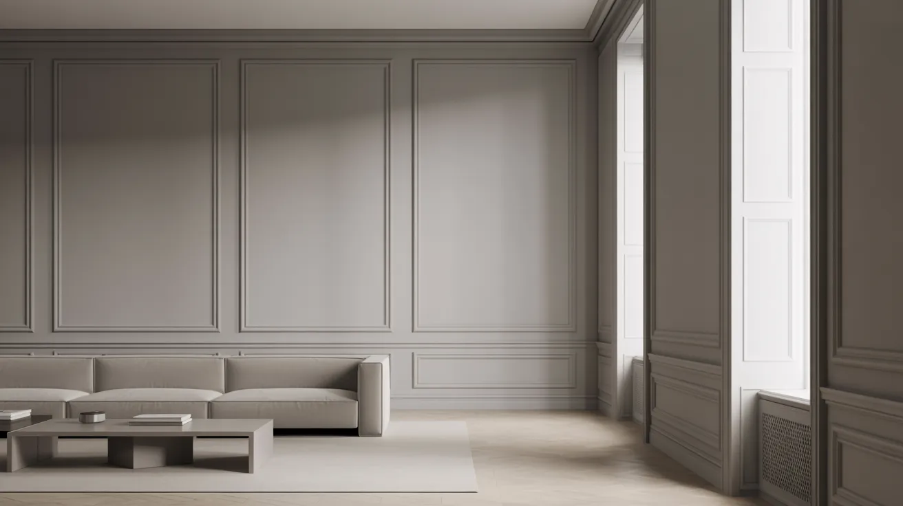
4. Dark Gray Walls with White Trim

Dark gray walls add real depth to a room. White trim keeps that depth from feeling too intense.
This combination creates a balanced contrast. The walls add weight and seriousness. The white trim keeps things from feeling closed in.
- Best for: Larger rooms with high ceilings, such as dining rooms, home offices, or living rooms.
- Pro Tip: In smaller rooms, dark gray can feel tight. If you’re unsure, test a large paint sample on the wall before committing.
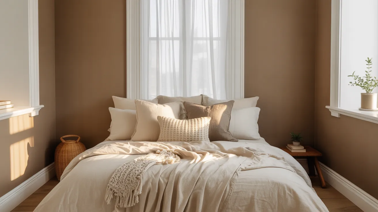
5. Beige Walls with Cream Trim

This is a warm, quiet combination. Beige walls and cream trim sit very close together on the color scale. The contrast is subtle. The result is cozy and traditional.
It’s a great choice if you want a room that feels settled and comfortable, with minimal visual noise.
- Best for: Traditional living rooms, bedrooms, and dining rooms.
- Pro Tip: Avoid bright white trim with beige walls. The sharp contrast between warm beige and cool white can make the room feel uneven.
6. Greige Walls with Crisp White Trim

Greige is a mix of gray and beige. It’s one of the most flexible neutral wall colors out there. It picks up warmth or coolness depending on the light in the room.
Pair it with crisp white trim, and the room gets a clean, finished look without feeling stark.
- Best for: Almost any room in the house. It’s a reliable, flexible choice.
- Pro Tip: Greige works well with wood floors, natural textures, and both warm and cool furniture tones.
7. Navy Blue Walls with White Trim

Navy and white is a classic pairing. The deep blue of the walls gives the room weight and seriousness. The white trim cuts through that depth, keeping the room feeling open.
This combination reads as confident and polished. It’s not casual. It means business.
- Best for: Bedrooms, home offices, and studies where you want focus and calm.
- Pro Tip: Use bright white, not off-white, with navy. Off-white next to navy can look faded. Bright white holds its own.
8. Soft Blue Walls with White Trim
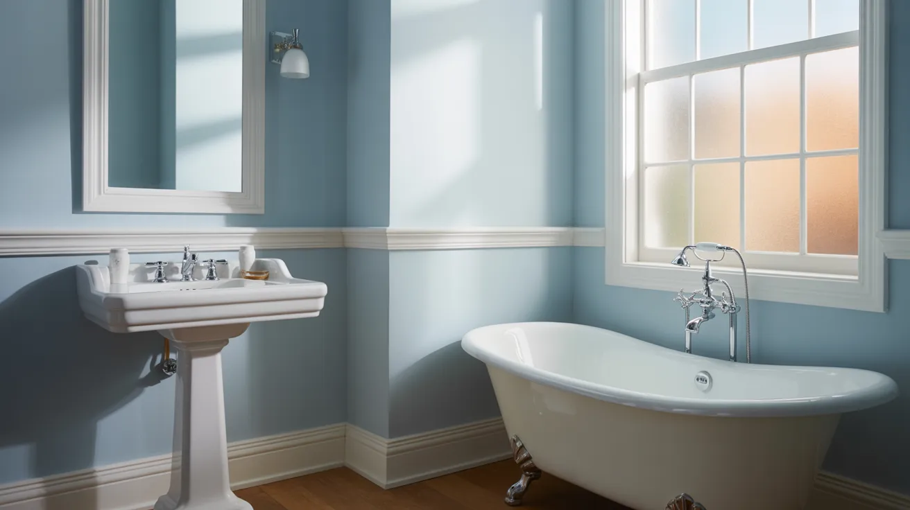
Soft blue walls feel light and clean. They don’t demand attention. They just sit there, calm and easy.
White trim keeps the look fresh. Together, they create a space that feels open and unhurried.
- Best for: Bathrooms and bedrooms, where a relaxed feel matters most.
- Pro Tip: Soft blue works especially well in rooms with natural light. It reflects light well, keeping the space from feeling dull.
9. Sage Green Walls with Off-White Trim
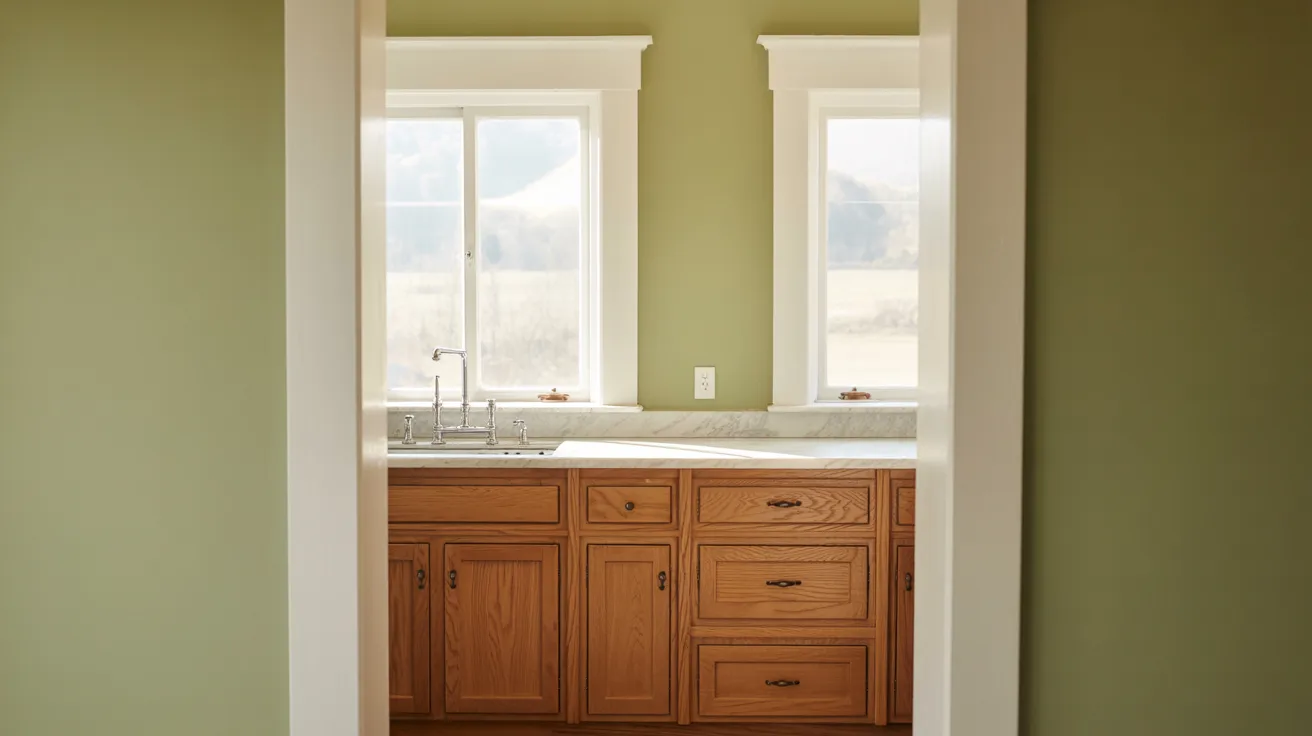
Sage green is a muted, natural tone. It doesn’t shout. It settles into a room quietly.
Off-white trim is the right partner here. Bright white can feel too sharp against sage green. Off-white keeps things soft and grounded.
- Best for: Kitchens, living rooms, and sunrooms.
- Pro Tip: Sage green reads differently in natural versus artificial light. Check your paint sample at different times of day before you decide.
10. Dark Green Walls with Warm White Trim
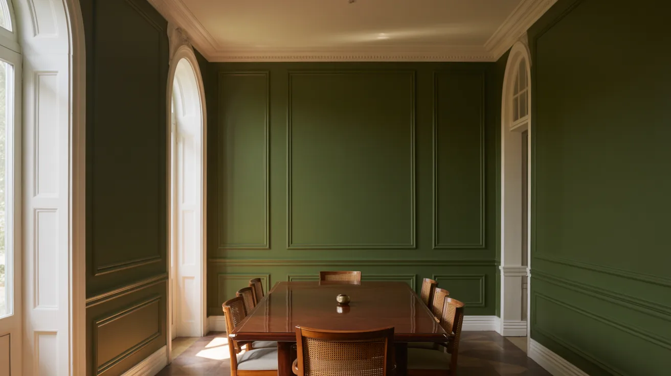
Dark green walls make a room feel rich and full. It’s a grounded, serious look. Not for the timid.
Warm white trim softens the combination. It keeps the dark green from feeling too intense and adds a bit of comfort to the space.
- Best for: Accent rooms, libraries, dining rooms, or any room where you want strong character.
- Pro Tip: Dark green pairs well with natural wood furniture and warm metals like brass or copper.
11. Black Walls with White Trim
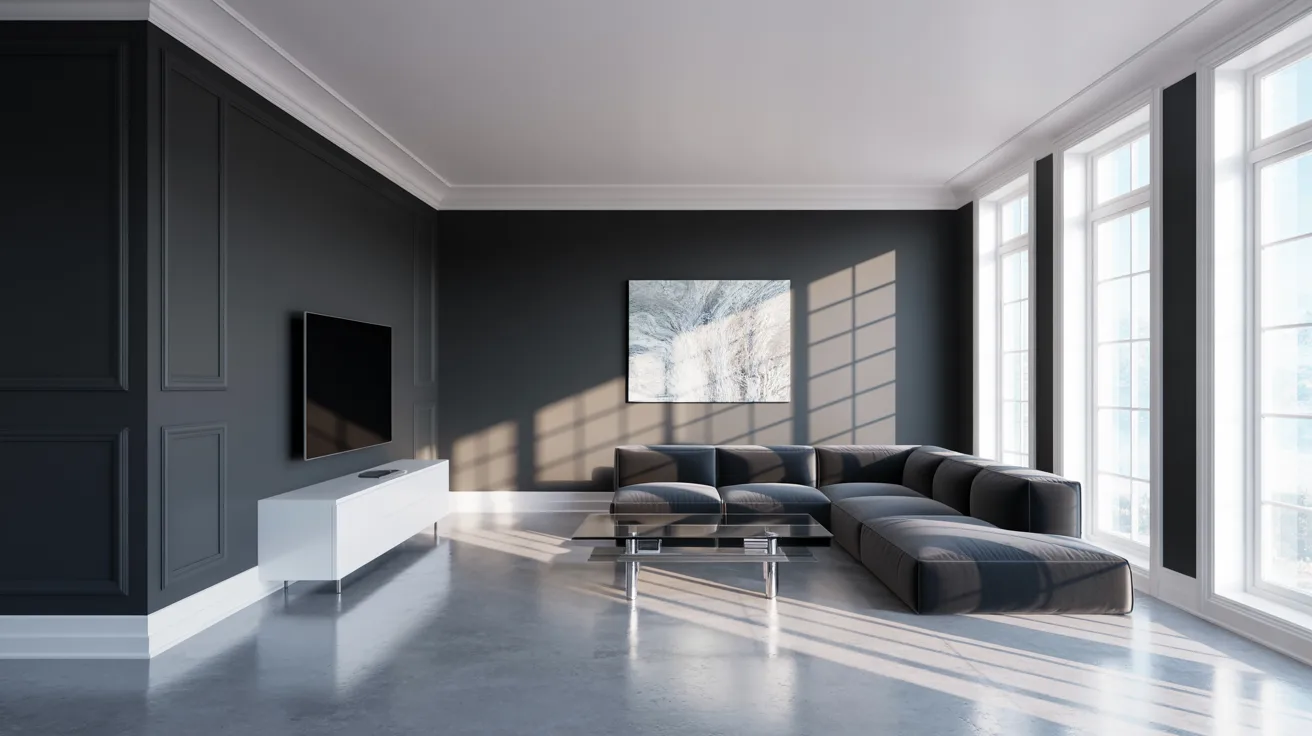
Black walls are dramatic. They flip the usual formula, making the room feel bold and intentional.
White trim is essential here. Without it, black walls can feel like a tunnel. The white trim gives the eye somewhere to land and breaks up the intensity.
- Best for: Well-lit rooms. A room with black walls needs good light, natural or artificial, to feel balanced rather than oppressive.
- Pro Tip: Matte black paint works better than gloss on walls. Gloss can show every imperfection and reflect light in distracting ways.
12. Monochromatic Walls and Trim
This one is different. Instead of picking two colors, pick one and use it on both walls and trim, in different finishes.
For example, the same soft gray on the walls in a flat finish, and the same gray on the trim in a satin or semi-gloss finish. The result is a smooth, unified look. The trim doesn’t disappear, but it doesn’t shout either.
- Best for: Modern, minimal interiors where you want texture and depth without color contrast.
- Pro Tip: The finish difference is what makes this work. Flat on the walls, satin or semi-gloss on the trim. Without that contrast, the two surfaces just blend together completely.
13. Earthy Taupe Walls with Soft White Trim
Taupe is a brownish-gray color. It’s warm but not as heavy as brown. It works in nearly every room.
Soft white trim adds just enough contrast to give the room definition. The pairing feels settled. Not trendy. Just solid.
- Best for: Bedrooms, living rooms, hallways, and any room where you want a low-effort, long-lasting look.
- Pro Tip: Taupe works well with both warm and cool accents. It’s one of the most flexible wall colors you can choose.
How to Choose the Right Wall and Trim Color Combination?
Picking a color combination is easy. Picking one that actually works in your room takes a little more thought. Here are five things to check before you commit.
-
Consider the lighting in your room. Light changes how every color looks. A warm beige can turn dull in a north-facing room. Check your paint samples in the morning, afternoon, and evening before deciding.
-
Match your undertones carefully. Every paint color carries a warm or cool undertone. When wall and trim undertones clash, the pairing feels off. Hold samples side by side in natural light to check.
-
Decide on your contrast level. High contrast makes a room feel sharp and defined. Low contrast feels soft and relaxed. Pick based on the mood you want.
-
Coordinate with your flooring and furniture. Your walls and trim share the room with everything else. Check your paint samples against your floor color and furniture before finalizing.
-
Test paint samples before finalizing. Paint a large sample directly on your wall. Live with it for a few days. Check it under different lights before buying a full can.
Conclusion
Choosing the right wall and trim color combinations doesn’t have to be complicated.
Start with the mood you want. Think about how much contrast you like. Check that your undertones work together. Then test your samples on the actual wall before buying a full can.
Small decisions like trim color make a bigger difference than most people expect. The wrong pairing can make a beautiful wall color fall flat. The right one pulls the whole room together.
You don’t need to get it perfect on the first try. You just need to take it one step at a time.
Found a combination you love from this list? Try it out and let us know how it turned out in the comments below. We’d love to see what you create.
